
No Serif for you!
Fonts are a lot

There's a lot going on in the wild wacky world of fonts. Fonts are a central element of your site and branding so be aware! Sans is French meaning without and Serif means those little tails you find in Olde English writing. I think Serif has Latin origin 🤷🏼♀️
Serif fonts are old school and you shouldn’t use them except for special purposes - like say you have one of those restaurants where Knights joust while your customers dine on an endless buffet of mushy peas.

Keep the number of fonts on any business asset - print or digital - to no more than two, three at most. Don’t confuse this with size or caps or italics or bold or underline - there are a lot of ways to use a font family. For example on my business card from my last post, "Wirepine" font is Montserrat Bold all caps, with wide letter spacing. This matches the font and treatment on my website wirepine.com. The biz card subheading 'Digital Marketing' font is Oswald all caps and then the contact info at the bottom is also Oswald but all lower case.
So get creative on using your two fonts but resist the urge to treat the font dropdown like hotdogs at the Costco food court. Unless you’re going for a very specific look, stay clear of Serif fonts. Google actually penalizes sites in ranking if they have too many fonts! They also look at wordcount, ratio of text to images/headings but that's a newsletter for another day …
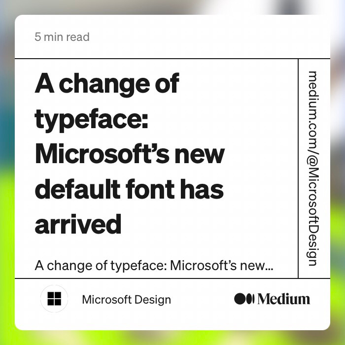
Microsoft commissioned 5 new font designs a couple of years ago that they added to Office and just now have picked the winner to become the new default replacing Calibri. The new one is called Aptos which is kinda fun as it’s namesake town Aptos is just 3 counties down the coast a smidge south of Santa Cruz.
When I was but a wee sprite my dad had a book that was filled with font samples and font samples alone. Have no idea why - but I remember pulling that book off the shelf more than any other and paging through it like I was reading a masterpiece. So, as you're working on your site or your brand - don’t forget the Fonts!